Income inequality analysis and visualization
Recently, I did some analysis of the income inequality data found from the world income inequality database and the US government historical income inequality data.
And I was amazed to find some insights through this process. The above is the tableau interactive notebook you can play with. Here I will just list the main findings of the data:
For US government data:
- Most age groups’ in US, the median & mean income diverge, and the gap is bigger and bigger as time goes on
- For the working males(24 to 65), the median incomes are stagnating since 1970s(inflation adjusted), which means most of the working males don’t see actual income increase through the last 40 years
- The top richest people are richer and richer during the same time. For example, the top 5% people’s income percent goes from around 17% in early 1970s to around 22.6% in 2017.
- The diverge of the rich and the poor can also be reflected by the gap between mean and median income, which means only a few people are much richer than before while the majority get barely nothing
- There is a big jump for the top 5% people from 1992 to 1993(from 18.6% to 21.0%), I then try to find what happened at that time, and it is actually some chaotic period for the Clinton administration, which he want to increase tax for rich class, but actually hurt the middle class.
- Although the average income for all ages(15 and older) increase from $2000 in early 1970s to $32,000 in 2017, the actual income(inflation adjusted) only increase from $16,000 to around $34,000 in 2017(only doubled instead 15x times)
And although I also don’t believe the official inflation rate truly reflect the actual number of inflation, but even let us take it as it is, I am stilled shocked by how the actual income of most people are stagnating over the past 40 years. If you want to know more about the inflation information, I recommend you to check the Shadow Statics about alternative measure of different economic indicators like inflation, unemployment, GDP etc.
For other countries, I also find some interesting points:
- Within 1991 to 1993, Russia sees a big jump for the GINI index, which is most likely due to the collapse of the Soviet Union.
- China was quite equal before the reform and opening(although quite poor at the same time)
- Europe is general more equal in income compare to other developed countries
- Most countries with high GINI index(greater than 40), the top 20% people will get around 50% income of all people.
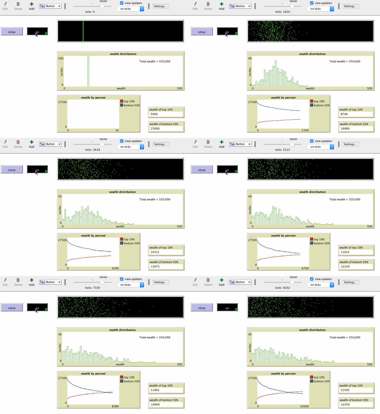
Actually, the “richer get richer while poor get poor” can be show in a very simple model in netlogo. In this “simple economy” model, we just need to initialize an amount of people and each with a fixed amount of money. In each round, one person just randomly select another person and give him/her one coin. So this is a extremely simple simulation of the economy system, there is on creation of new things, no money printing etc. But even in this ideal world, we could actually see inequality occurs.
When the system is running and running, we can notice that the top 10 richest people get more and more money while the amount of the bottom 50 are less and less which means some people just accumulate a lot of wealth totally by lucky and the system become less and less equal overtime. It can be shown as in the following image which record the running of the model:

NetLogo Simple Economy Model
And very interesting, the distribution of the wealth change from like a normal distribution at the beginning to right skew and then finally to a exponential like distribution in the late phase. So it means in this really simple economic world, income inequality could happen, and I believe all the thing like Quantitative Easing just aggravate the inequality of the world.
This is an interactive notebook and you can play with the data by selecting different filters. And I find it is normally more useful to use visualization to show interesting phenomena than plain numbers. If you find some other interesting things, you’re welcome to comment after the post :).
m00nlight 24 November 2018